Feedback on assignment 5 – the tutor report was really useful – thanks Christian – and following his suggestions I’ve revisited a few things, primarily logos. So here goes… first, the Chance Housing Association logo, picking up on this comment in the report:
The sloping text gives the piece a good visual dynamic but maybe suggests all their houses are at a tilt. The descending g of housing connects to the white space around the logo, finding an equivalent link with the word Chance could have pulled the whole thing together (or perhaps not connecting the g to the bottom would’ve given you a different dynamic).

De-sloping takes away a bit of the energy, but took ‘Housing Association’ out of the bottom block to see what happened. Just used one font and tried to tie it all together… and after a lot of re-arranging, added a baseline, hooked that g back onto it, and stacked the whole lot up on top. Looks flat without the slope and slightly deflated, but maybe a bit more twiddling with the weight of the baseline might do it??
French Hen logo revisited: this was about taking out the block shape and using the text to replace the shape the hen stands on – this was the comment:
Logos are deceptively tricky things to pull off, and my only reservation was the object the Hen was stood on – it’s the largest visual element in the logo and the hardest to read – perhaps it would be worth thinking about whether you can get the typography to do the job of the mound…
The shape originally came about by accident – pressing the wrong button – but I quite liked it, so kept it and built the whole thing around it > in my head, looked a bit like an artist’s palette evoking Paris cafe scene at end of 19th century… Consequently better to ditch rather than twiddle – these are some ideas, and there’s some promise in here I think…

Gerald Anthony Furniture Store logo revisited: this was the logo for the assignment, for which I’ld had a complete ideas bypass in the first place, having had to give up on it while I did the rest of the assignment, to come back to it at the end. Reflected in this comment:
The only element that I felt needed a bit of a boost was the logo itself – I thought it worked perfectly well in combination with all the other visual elements on the page, but once away from that it started to feel a little flat. Basically I think it could have done with a different typeface, just to pull it out.
I played around with a heavier typeface to try and pull out ‘furniture store’ more, and tried a few things with the pale green background – the latter didn’t work at all. I also tried the other suggestion of adding a bit of furniture, and the following tryouts are the results. I’m still not very happy with any of it! But I did find this toy to help match up fonts: typeconnection A Typographic Dating Game


Enough of logos, but staying with Gerald Anthony Furniture Store, I picked up on a couple of comments on the Annual Review:
The only element I was less certain of was the block section headers, which felt a little heavy in comparison to the rest of the work – perhaps the corners needed to be rounded or the combination of colours lighter? Not sure about the first letter of each paragraph being pulled out either, perhaps a little over decorative given your aim to keep it simple?
I simplified the paragraph layout, broke up the text more, and made the font slightly smaller. I also softened the edges of the block section headers and it looked better > GAFS report v2 tryout1 On another couple of pages, I changed the block section headers to make the background lighter and the text brighter. I also added some green block-quotes into the article and re-balanced the two pages a bit > GAFS report v2 tryout2 – and this worked, it looked a lot brighter and lighter. Finally, I swapped out the logos on the cover with one of the bolder versions, which looked better, but the basic problem here I think, is the fact they were added on at the end, and not designed into the pages with more emphasis > GAFS report v2 tryout3
Finally, the Singing Workshop poster:
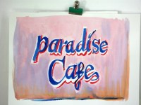
However the rest of the poster (images in the background) felt a bit unnecessary visually, almost as if you were filling the space. Overall it worked but perhaps lacked the punch needed to compete on a busy noticeboard…
So much for my collage… but, when I was doing this, I wasn’t thinking about competing space on a noticeboard, I was thinking about it stuck up in a shop window, and that does make a difference. So, I redid the background in black and white, zapped up the header and removed all the illustration layers apart from one. The last remaining illustration would need a quality upgrade, if I was to go with this. Singing lessons poster revisited is the new poster, and this is just the background image: