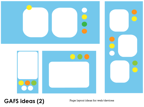
The focus of this chapter/assignment is layout. The task is about designing a logo, letterhead, business card, annual review and a website front page mockup – presumably to a house style. This means a generic design layout idea that can work across a range of mediums and sizes, and given it’s a small charity, it hasn’t got to be expensive or complicated. It’s got to be adaptable and fit into all manner of rectangular shapes, basically. Also thinking about the logo which needs to be the most adaptable of the lot. Keywords here: flexibile, stretchy, responsive, proportionality, balance. Looking for a method…
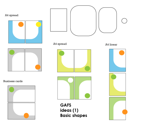
To start with, played around with some basic box shapes:
Thinking about the tools: websites often start with Photoshop. Indesign is basically about boxes on grids – the boxes are stretchy, the grids are fixed. Pixels and vectors – fixed and stretchy. Looking at web grids and the whole debate about working to fixed widths, or flexible relative widths, or some combination. Basically it’s about building boxes within boxes and creating the rules for what happens when there isn’t enough horizontal space for all the objects contained within a particular box. Paper deals in fixed sizes, but designs usually have to work across a range of proportional sizes – ie A4 > A5 portrait > A6 landscape postcard > business card. So it’s pretty much the same.
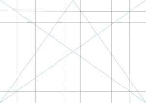
Thinking about grid systems and proportionality, the ubiquity of the rectangle, and the biology of the eye… did a bit of reading round looking at grids based on the golden section (for proportionality). I picked out one grid design to try out for the report > A4 spread and A4 single page:
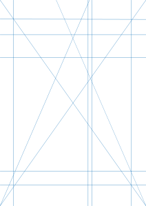 Source: http://www.markboulton.co.uk/journal/comments/five-simple-steps-to-designing-grid-systems-part-2
I tested the grid by adding the basic shapes to see if it works (ie creates balance) and it looked quite promising: A4 grid tryout, A4 grid tryout 1, A4 grid tryout 2, A4 spread tryout.
I also picked out this more-basic-than-basic web design template to try:
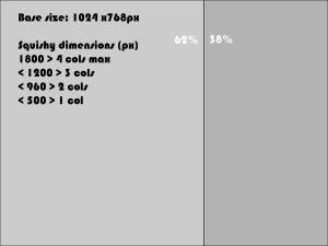
Source: http://www.markboulton.co.uk/journal/comments/five-simple-steps-to-designing-grid-systems-part-5
And finally a couple of ratios for reference: A4 paper > 1:1414, Golden section > 1:1.618

