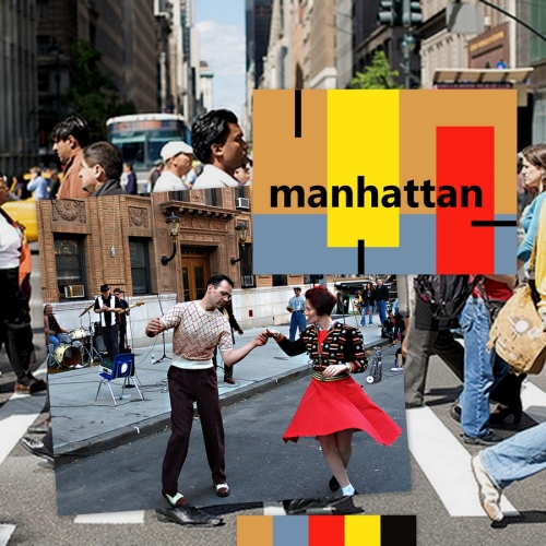
What was I doing? These collages are made up of the 2 photos, colour palette(s) and design for each city.

Madrid > aim of this one was to pick out the rich ochre colours from the buildings and zing it up with an acid yellow sun, aiming to convey warmth and vibrancy etc etc. The inset photo of the girls and the metro didn’t really convey this image, but the colours are in there! Needs a bit of re-arranging in the frame.

Malmo > this is based on the photo of the woman on the bike which conveys Scandinavia (to me) but looked for a more specific photo too – used the painted houses to complete the palette, and abstracted them as the stripes in the final design.

Managua > looked for a busy bus station photo and a contrasting chilling in the sun one. The colours don’t balance too well and the cerise pink is wrong – need juggling a bit? more contrast? start again? Should have just used the bus station I think.

Manchester > a street scene in the rain with a red hoody highlight, or a cafe scene through a window. Decided to use the latter, and not attempt to roll them into one this time. Abstracted the scene, quite like the coffee table with the mug. Is this the right sort of image for this sort of guidebook – what sort of guidebook is it???

Manhattan > this is street scenes, love this photo of the dancers, which makes the place look alive, so tried to recreate that on the design, particularly the sharpness of the red dress.

Marrakech > this is too dusty and all out of balance – think need to look at the accent colours more – ie the sleeves of both men and those gums. The text shouldn’t sit at the back either.

Marseille > people chilling, 2 contrasting sides to the city. The colours of the 2 photos are quite different, so just used the fresher cafe scene. Not enough contrast though, and the other photo/palette is more vibrant – would convey a different feel to the place.

Melbourne > two completely different photos and some interesting expressions – pulled out some of the common colours, and managed to produce an ice-cream. The red highlight is meant to disguise that. I think the text and the balancing block of pink colour work here, they didn’t in Marrakech.

Montreal > a building with washing, and a street scene highlighting the Montreal Jazz festival. I’ve taken the colours from the clothes and the pattern from the washing. I have no mental picture of Montreal, so would need to do some more research, I’ve no idea if this would work or not.

Mumbai > I’ve used the heavy contrast of the dark clothes, silhouettes, and dusty buildings, and contrasted them with the bright flashes of colour on the cart, and the clothes of the woman in the top photo. I think this one works best.

 The task: 10 abstract designs balancing blocks of subordinate, dominant and accent colours, for (A5 landscape) guidebook covers, for cities beginning with M.


