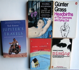
 More from the bookshelves. Gunter Grass and Thomas Hauser from about 1980, bold design based around chunky text, black and white with one colour. Isabel Allende, 1990-ish, functional back, orange spine, frontcover illustration with title text box overlaid, possibly hinting at the Virago style. Ted Simon and Stella Gibbons reprints in standard noughties full cover design style with toned-in coloured text, and smoother cover paper. Uniformity with other publishers through production technology shifts. As with the Virago’s the branding is virtually all in the logo (which appears on all 3 faces with these). Stella Gibbons nice illustration by named artist, possibly part of a classics series deliberately using retro smaller size.
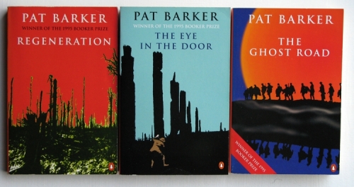
Pat Barker trilogy
This is an example of standard Penguin functional fction style in the 90’s – orange spine, functional back covers with centred text. Uniformity of text style and placement on the covers, and some similarity of illustrations, to tie them together as a trilogy.
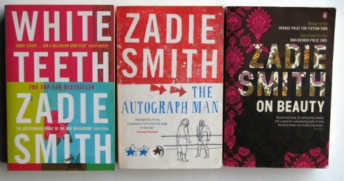
Zadie Smith
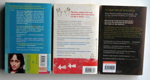
Noughties style, three independent novels by the same author, fullcover designs, Autograph Man with a fancy bit of cutout on the cover. What can I read into these… ‘White Teeth’ is maybe a reprint of the bestseller first novel – note title first, then author, and mugshot on back – possibly issued about the same time as ‘ The Autograph Man’ was published by a now, well-recognised author. ‘On Beauty’ is a later book, but the title style still carries through enough to create a visual tie-in to the author’s name. The back cover of ‘White Teeth’ is interesting where there’s been an attempt to design in the functional stuff at the bottom. Note how the Penguin logo is less orange and uniform on the earlier 2, but returns in conventional style on the 3rd.

